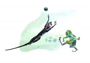
I first saw South African rock art when I just turned twenty. My family was then travelling down south through Zimbabwe. We stopped to see the city of Bulawayo and see the famed Matobo Hills.
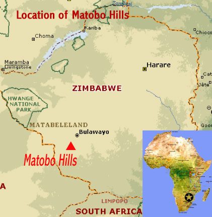
South African rock art is found in various locations within Southern Africa, such as South Africa, Lesotho, Swaziland, Botswana, Zimbabwe, Mozambique and Namibia.
The Matobo Hills are a UNESCO World Heritage site and are situated about 35 kilometers away from Bulawayo, the second largest city in Zimbabwe. This site is famed for being the largest concentration of rock art in the Southern African region.
The rock art in this region was created by the hunter-gatherer San people and is estimated to be at least 13,000 thousand years old and has been extensively studied. The paintings consist of depictions of human-like figures as well as animals and zoomorphic figures. They are executed as paintings and petroglyphs in bichrome and monochrome on boulders, caves, and cliffs in the landscape. According to the UNESCO site, these paintings illustrate evolving artistic styles and also socio-religious beliefs.
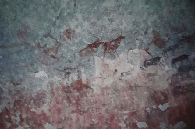
I was mesmerized by the beauty of Matobo Hills and the rock art on its cave walls. Here are two images. These are photos I took in the caves of the Matobo Hills. I was lucky enough to find them just as I was completing this post.

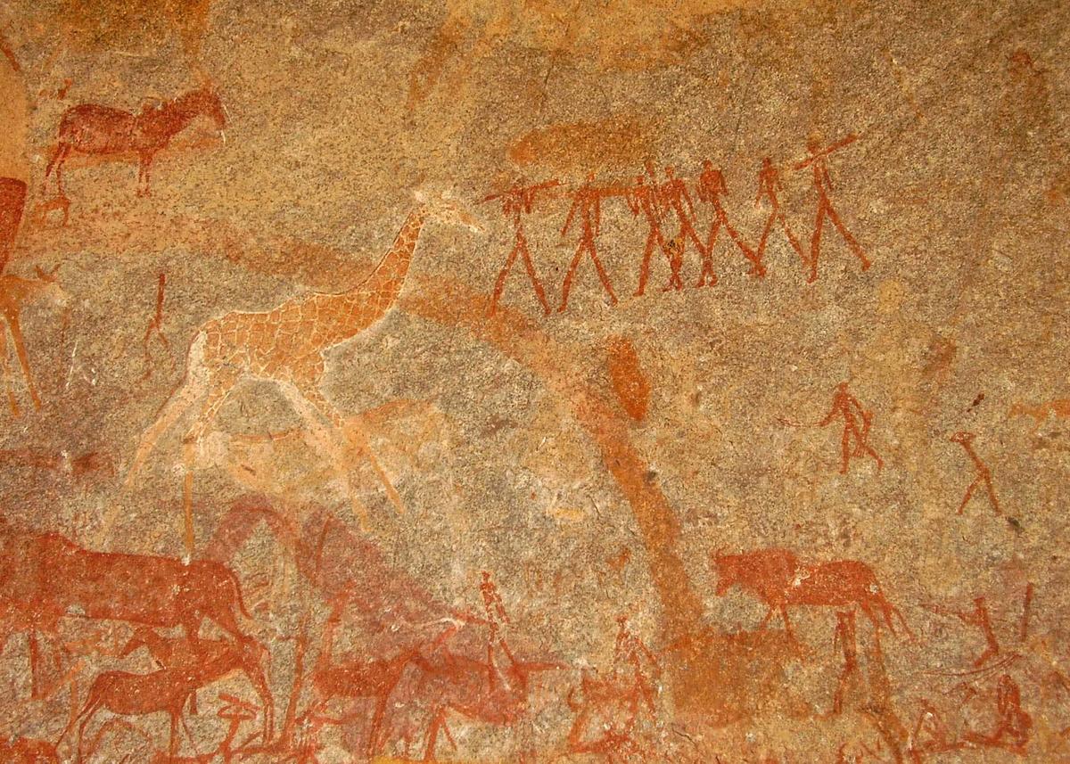
This next picture, from the World Monument Fund site, shows animals and human figures.
At the bookshop on site, I bought a booklet about Matobo Hill rock art. As we drove further down south towards the border of Botswana, I listed through the booklet with great interest.
At that time, I wasn’t aware how deep of an impression the Matobo Hills had left on me. South African Rock Art etched itself deeply in my mind. Much later, it became the creative impulse behind the illustrations in The Contest.
Three things that blew my mind
The three things about South African rock art that I noted and which inspired me were the;
- Limited color palette – bi-chrome or monochrome paintings and petroglyphs
- Absence of facial features in the depiction of human figures – no depiction of facial mimicry and reliance on it for expression
- Little or no depiction of setting and landscape
Possibly, as a result of the three characteristics stated above, there is a strong focus on the use of line to depict both humans and animals in motion.
Around the time I started work on my illustrations for The Contest, I had also been looking at Arthur Rackham’s illustrations of Cinderella published in 1919. To my surprise, I discovered some remarkable similarities between the rock art and illustrations even though both works were created in different historical periods, by different people inhabiting different parts of the world, and for different purposes.
Similar Traits
To me, what stood out in Arthur Rackham’s illustration of Cinderella were;
- Use of silhouettes and hence a reduction in the depiction of facial detail and hence facial mimicry.
- Silhouettes (black and white) which meant working in monochrome
- Minimal depiction of landscape and setting. There are a few exceptions to this, where a few illustrations do indeed depict furniture and trees.
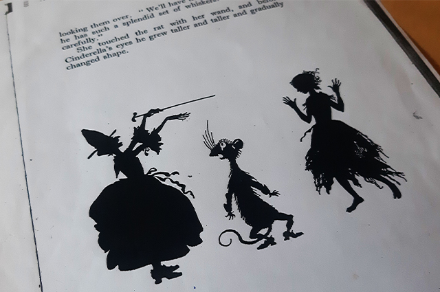
Similarities between South African Rock art and Arthur Rackham’s illustrations
To sum up, I noticed that there was an economy of detail common to both Rackham’s Cinderella illustrations and South African Rock art. This economy of detail, had in both cases, resulted in highly evocative art.
How I adopted and integrated these ideas
- I discarded the idea of illustrating setting very early on
- I discarded the idea of depicting features on human figures and thereby eliminated the use of facial mimicry to depict expression.
- I discarded the use of full color
I decided to focus on telling the story though the depiction of movement and work in black and white.
Representing Ananse
I thought long and hard about how I would represent Ananse. A spider with the character and foibles of man? A man that moved like a spider?
I sketched in pencil and modeled my figures on human depictions in rock art – a small head and proportionately longer, leaner limbs. I emphasized Ananse’s leanness, malleability and in opposition to predecessors’ representation, created a very lean stomach that served as a pivot point from which I could bend the character at will.

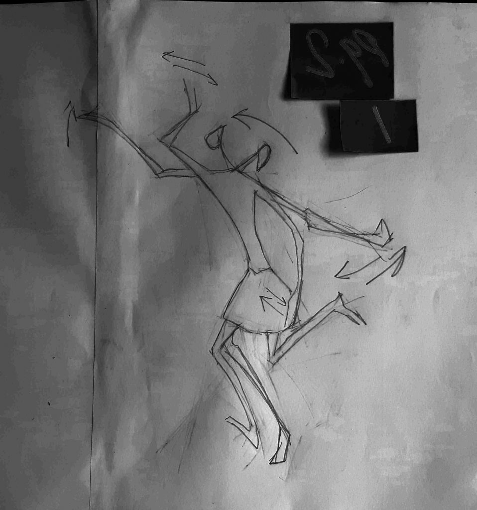
I gave Ananse additional limbs – a total of eight as in the spider. Ananse was now both man and spider, evidenced in the number of limbs and his uncanny spider like, implied movements.
Ananse’s eight limbs were important, not simply to allude to him being a spider. I wanted these eight limbs to represent his ability to do much more; more planning, more scheming, and enable faster escapes.


